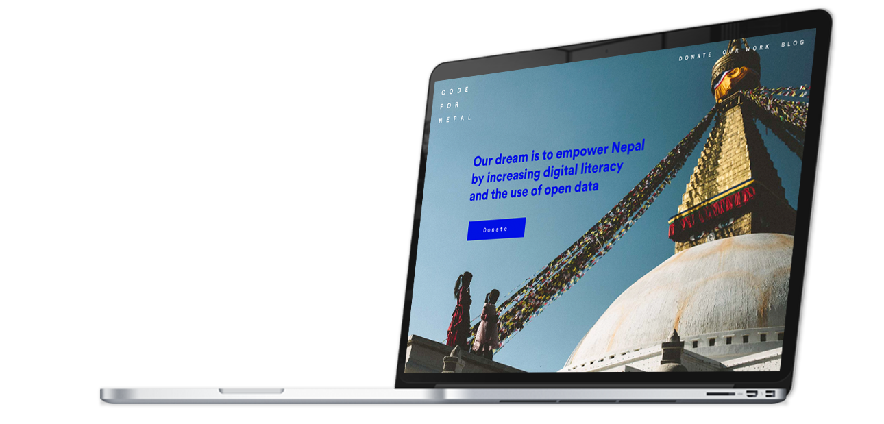
A simple web page with a clear call to action has made nonprofits like Unicef significantly raise their donations. Yet many non-profits still struggle to communicate their causes in a clear way. Code for Nepal is one of them.

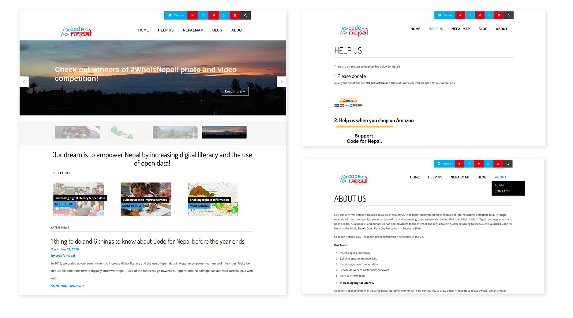
I focused the redesign around solving current usability issues. I identified the following:
- Lack a strong call to action.
- It's unclear what the organization does.
- It's hard to perform common user flows such as reading about the causes and making a donation.
- The donation form is tricky to fill out.
- Scattered visual language.

For the redesign I made the common user journeys more intuitive, and clearly communicate the mission and the causes early on. I focused on a strong call to action in multiple places, as well as adding bigger photos and an updated visual language.
