Product design at Basecamp
Below are some of the projects I worked on during my internship at Basecamp.
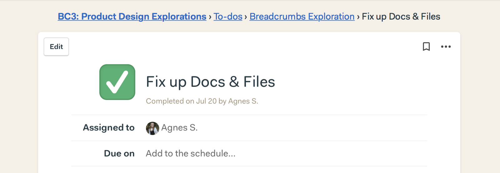
Better navigation with breadcrumbs
I wrote a Signal v. noise article about my first project, explaining how we went back to the basics to create a better way of navigating in Basecamp.
Actionable Blank Slates
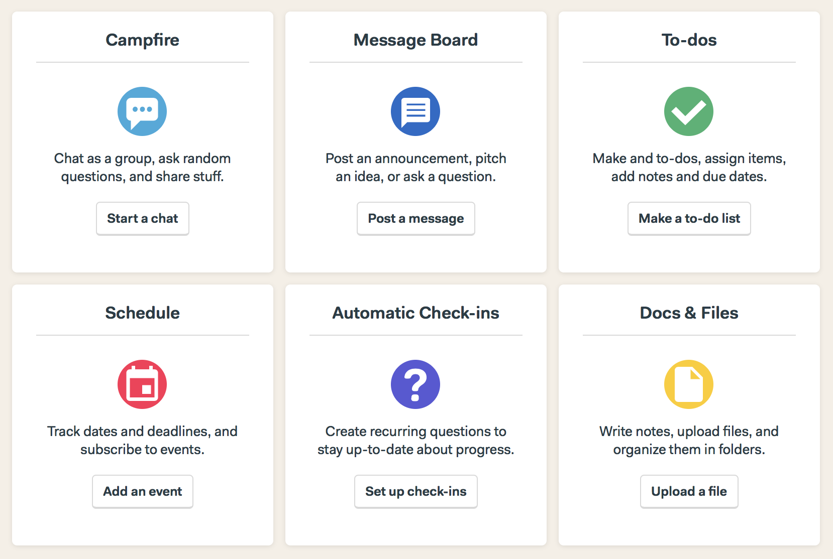
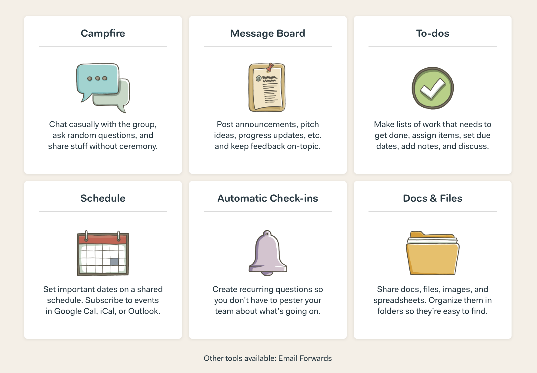
When starting a new project in Basecamp, you are faced with a bunch of tools to pick from. Each tool has a lot of copy explaining what it's for, but there are no clear actions. (You have to click on the card to get started, but we don't state that anywhere.)
I wanted to take a stab at making it feel easier to jump in–simply by making these blank slates actionable. I designed and built an A/B test.
Before, this is what the blank slates looked like:
By using shorter copy, simpler imagery, and most importantly–clear actions, I was hoping the new cards would be easier to digest and feel more inviting. People in the test saw this:
